Index
- 1. Hyperminimalism: the visual language of AI companies
- 2. Maximalism: when excess becomes identity
- 3. The return of the human touch in web design
- 4. Basic palettes and “primary” colours with a modern twist
- 5. The blueprint style: explaining complexity through design
- 6. Animations and immersive storytelling accessible to designers
- 7. Internet nostalgia: retro aesthetics and digital memory
- 8. Music and sounds in web microinteractions
- 9. Tech gradients: why they continue to work
- Conclusion

Web design in 2026 moves between seemingly opposite extremes: hyper-minimalism and maximalism, advanced technology and a return to the past, silent experiences and sound interactions. The emerging trends reflect cultural, technological, and perceptual changes but should not be interpreted as universal rules.
Although following trends can help you stay relevant, every design choice should start with the site's objective, target audience, and the context in which the project exists. Trends are tools, not automatic solutions: adopting them without a strategy risks compromising usability, clarity, and results.
1. Hyperminimalism: the visual language of AI companies
This is an extremely reduced form of minimalism that focuses on the essentials: it eliminates all superfluous visual elements to achieve maximum clarity and focus on content, uses ample white space, simple typography and often a very limited colour palette to create a calm, intuitive and high-quality user experience, where every element must have a clear purpose.
2. Maximalism: when excess becomes identity
When it comes to web design, maximalism means thinking big and making designs that are even bigger. It's about bold fonts, complicated layouts, rich textures, and fancy colour schemes. It's a party for the senses and a celebration of abundance. However, it's not about gathering elements at random. The key to successful maximalism is thoughtful organisation and the ability to tell a coherent story through design.
3. The return of the human touch in web design
People stay away from things that look fake or were made by AI and instead focus on promoting realness and emotion. This style can take the form of imperfect underlining under text, arrows and elements that look hand-drawn, raw photos or photos that look like they were taken with an old mobile phone, and textures such as paper or ink stains.
4. Basic palettes and “primary” colours with a modern twist

In our article on web design trends for 2024, we talked about a return to bright, intense and vibrant colour palettes. However, it seems that prolonged use of these shades is tiring, and a reaction to this year's excessive visual saturation will be a return to simple, basic colour palettes.
Note, however, that this does not mean the pure use of primary colours, but rather a play with shades, tints, nuances and shading that gives a fresh touch, making everything creative and modern but at the same time comfortable and immediate. One colour that is visibly gaining popularity is orange.
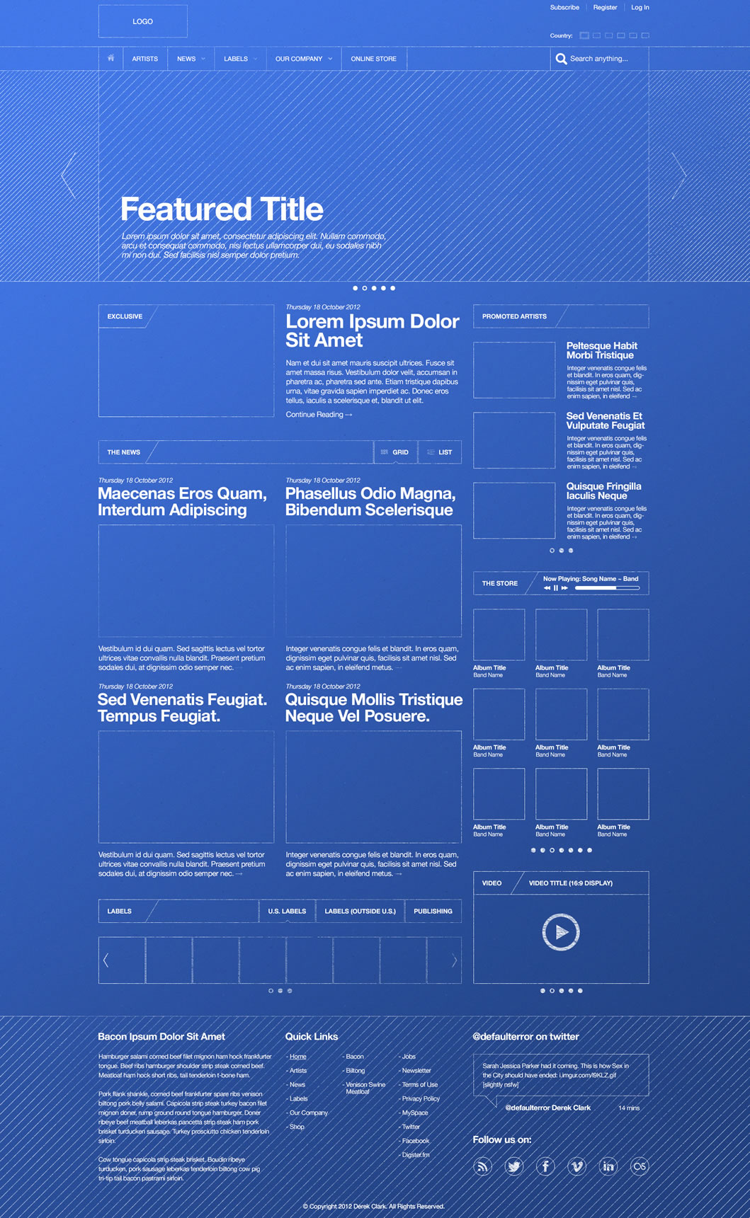
5. The blueprint style: explaining complexity through design
Another style that is becoming increasingly common is one reminiscent of blueprints or manuals, with many small elements, labels, lines and dots that appear to be important, or the replacement of real images with low-fidelity drawings, monospaced text, and fonts that resemble those found in instruction manuals.
This approach is not only used to create an industrial or high-tech look but also to convey precision, transparency and technical expertise. Often used on tech, engineering or educational websites, it communicates that complexity is broken down and made understandable.
6. Animations and immersive storytelling accessible to designers
So, expect to see 3D elements or dynamic models that become narrative and functional tools. In fact, the creation of these visual elements lends itself particularly well to creating immersive experiences or unique storytelling (motion storytelling). However, it should always be remembered that animations should only be implemented if they go hand in hand with the overall objective of the website.
7. Internet nostalgia: retro aesthetics and digital memory
There seems to be a return to nostalgia for the web ‘of yesteryear’, with particular attention to the early 2000s. This can already be seen in the use of vintage digital elements: custom cursors, a very simple and square user interface, ASCII images, and retro website browsing experiences.
These devices are not simply nostalgic but evoke a collective memory of the early Internet era and can create a strong emotional connection with tech-savvy or nostalgic audiences. To see if this style works, you can start with small steps, perhaps working on the mouse cursor or pixelated icons.
8. Music and sounds in web microinteractions

Have you ever visited a website or webpage and heard a song start playing? Or perhaps you've heard sound effects when interacting with the page? More and more websites are incorporating these musical elements, from entire songs to micro sounds that emit clicks or beeps depending on the interaction (clicks, hovering, transitions).
This trend stems from the mobile habit of receiving audio feedback and uses audio UX to reinforce feedback, satisfaction and a sense of direct interaction, without being invasive.
9. Tech gradients: why they continue to work
.jpg)
The last trend concerns gradients, which appear mainly on tech and SaaS websites and have now become a recognisable visual code. These are mostly delicate blends of purple, blue, aqua green or light orange, which not only give websites in this sector a modern and innovative look but also add visual depth to otherwise flat layouts.
Conclusion
The web design trends of 2026, from hyper-minimalism inspired by AI brands to digital nostalgia, and from immersive animations to the use of sound, show a web that is increasingly expressive, sensory and experience-orientated. However, no trend is universally valid.
The real value lies in knowing how to choose consciously: understanding when a trend reinforces the brand message and when, on the other hand, it risks distracting or complicating the experience. A good project is not one that follows all the fads but one that uses design as a means to achieve a clear, measurable goal that is consistent with the needs of users.
The real value lies in knowing how to choose consciously: understanding when a trend reinforces the brand message and when, on the other hand, it risks distracting or complicating the experience. A good project is not one that follows all the fads but one that uses design as a means to achieve a clear, measurable goal that is consistent with the needs of users.


.jpg)

